
cohort retention by acquisition source
Cohort Retention by Acquisition Source: Which Channels Bring Customers Who Stay
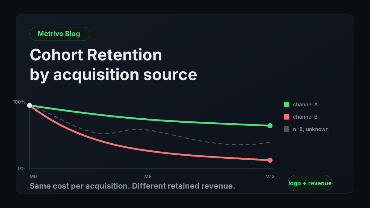
Rank channels on retained revenue, not first payments. Build logo and revenue cohort curves by acquisition source, with sample-size floors and the confounders that fake a result.
The metric your channel budget is probably built on
Concise answer
Most channel budgets are allocated on cost per first payment. That number is knowable within days, which is why it wins, and it is silent about retention, which is why it misleads.
Follow the logic of a normal channel decision. A campaign spends 4,000 and produces 40 first payments. Cost per acquisition is 100. Average plan is 49 a month. Payback looks like roughly two months, which is excellent, so the budget goes up.
The number that decides this is knowable four days after the campaign runs. That immediacy is exactly why it dominates: it fits inside a weekly review, it does not require waiting, and it feels like a fact rather than a projection. The problem is that it is a fact about a transaction, not about a customer.
Now suppose those 40 customers retain differently than your average. If half are gone by month four, the campaign produced roughly 4,900 in total revenue against 4,000 in spend, before any cost of serving them. The same campaign, with the same cost per acquisition, is either a strong investment or a rounding error depending entirely on a number the decision never consulted.
This is not an argument against measuring acquisition. It is an argument that acquisition metrics are the first half of a calculation that most teams never finish. If you have already connected payments to sources, you have the raw material; the MRR attribution by source guide covers getting to that point. This article is what to do with it once you have more than one month of history.
Why averages will not rescue you
The standard patch is to apply an average customer lifetime to every channel: take blended monthly churn, invert it, multiply by average revenue, call it lifetime value, divide by cost per acquisition. This is worse than no answer, because it looks like an answer.
The arithmetic assumes a constant hazard rate, which retention curves reliably violate. Early-month churn is almost always steeper than late-month churn, because the population that survives month three is systematically different from the population that entered it. A single averaged lifetime overstates the value of high-early-churn channels and understates the value of slow-and-steady ones, which is precisely the comparison you were trying to make.
Worse, applying the blended rate to every channel assumes the thing you set out to test. If channels retained identically there would be no reason to run this analysis at all.
What a cohort actually is
A cohort is a group of customers who share a starting event, tracked forward together. For retention work the starting event should be the first successful payment, not the signup and not the trial start.
Using signup as the anchor mixes trial abandonment into retention, and those are different problems with different owners. Trial-to-paid belongs to the funnel; retention begins when money starts moving. Keeping them separate lets you tell a channel that converts poorly but retains superbly apart from one that does the reverse, and those two channels want opposite interventions.
The second dimension is the source that acquired the customer, taken from the attribution on their first payment. Every subsequent measurement is then a cell in a grid: this source, this starting month, this many months later.
Two curves that must be read together
Concise answer
Logo retention counts customers still paying. Revenue retention counts money still arriving from the original group. They diverge whenever customers upgrade or downgrade, and the divergence is usually the most useful thing on the chart.
Logo retention, sometimes called customer retention, is the share of a cohort still paying anything at all in month N. It is bounded by 100 percent, it only falls, and it answers a simple question: are these customers still here.
Revenue retention is the share of the cohort's original monthly revenue still arriving in month N. It is not bounded by 100 percent, because customers who remain can pay more than they did at the start. Net revenue retention above 100 means expansion from surviving customers exceeded everything lost to churn and downgrades.
Reading either alone produces a confident wrong conclusion. A channel showing 55 percent logo retention at month twelve looks poor until you see 120 percent revenue retention, which says it delivers a small number of accounts that grow substantially. The reverse pattern, 85 percent logo and 70 percent revenue, says customers stay but shrink, which is a pricing or packaging problem masquerading as a healthy retention number.
| Logo retention | Revenue retention | What it indicates | Where to look |
|---|---|---|---|
| High | High | Durable, expanding accounts | Increase spend if acquisition cost allows |
| High | Low | Customers stay but shrink | Pricing, packaging, downgrade paths |
| Low | High | Few accounts, but they grow | Qualification; the channel may be reaching the right buyer inefficiently |
| Low | Low | Neither stays nor grows | Fit between the channel's promise and the product |
| Any | Volatile month to month | Cohort too small to read | Report as unknown; do not rank |
Gross versus net revenue retention
Gross revenue retention excludes expansion, so it is capped at 100 percent and measures only what you lost. Net revenue retention includes expansion and can exceed 100.
For channel comparison, compute both. Net alone can hide a serious churn problem inside one or two large expansions, particularly in a small cohort where a single account upgrading materially can lift the whole line. Gross tells you what the channel loses; net tells you what it is worth. A channel with a weak gross curve and a strong net curve is carrying concentration risk, and that belongs in the decision.
Metrivo's cohort retention exposes customer and revenue modes separately for this reason, so expansion is visible as its own effect rather than folded into a single number.
Where involuntary churn hides in the curve
A drop in a retention curve does not distinguish a customer who left from a customer whose card failed. Both stop paying. Both leave the cohort. On the chart they are the same pixel.
This matters for channel comparison specifically, because payment-failure rates differ by channel through payment-method mix and geography. A channel that appears to retain poorly may be retaining fine and failing at the card. That is a fixable billing problem, not a reason to cut spend, and the two conclusions lead to opposite actions.
Before you draw conclusions from a channel's retention curve, subtract involuntary churn from it. The involuntary churn audit covers how to measure that separately so it can be removed from the retention story rather than silently distorting it.
Building the table
Concise answer
Derive subscription events from payments, place each customer in a start-month cohort, tag the cohort with the source from the first payment, then compute survival and revenue for each subsequent month.
The mechanics are unglamorous and the failure modes are all in the details.
Derive events from payments, not from cancellations
The tempting source of truth is your provider's subscription status. It is unreliable for retention because status transitions depend on configuration: when a delinquent subscription is marked cancelled is a setting you chose, and it differs across providers, which makes multi-provider retention incomparable.
Derive from payments instead. A customer who paid this month is retained this month. A customer whose expected billing window passed without a payment has churned, whatever their subscription status says. This definition is provider-independent and does not move when someone changes a dunning setting.
Metrivo classifies derived subscription events into first payment, renewal at the same amount, expansion above the previous amount, contraction below it, churn when a subscription stops producing payments within its expected billing window, and reactivation when a previously churned customer starts paying again. Retention is then computed from that classified series rather than from provider status fields.
Anchor the cohort and tag the source
Cohort month is the calendar month of the first successful payment. Use UTC month boundaries consistently; a customer whose first payment lands at 23:40 local time on the last day of a month can otherwise fall into different cohorts depending on which timezone the query ran in.
Source is taken from the attribution on that first payment and then frozen. It does not update if the customer later arrives through a different channel, because the question is which channel acquired them. Freezing it also prevents a customer from silently migrating between cohorts and making historical curves unreproducible.
Carry the confidence label with the source. A cohort assembled mostly from inferred matches is a weaker piece of evidence than one assembled from confirmed ones, and the distinction is documented under attribution confidence. Where the source is unknown, keep those customers in an explicit unknown cohort. Excluding them quietly biases every other cohort, because unattributed payments are rarely a random sample.
Compute the cells
For each cohort and each month offset, the logo retention cell is the count of customers from that cohort with a successful payment in that month, divided by the cohort's original size. The revenue retention cell is the sum of monthly revenue from that cohort's surviving customers in that month, divided by the cohort's original monthly revenue.
Handle reactivation explicitly. A customer who churns in month three and returns in month seven appears in month seven's cell under one policy and not under another. Either is defensible; both must be applied to every cohort. Metrivo classifies reactivation as its own event type, so it can be included or excluded deliberately rather than by accident.
Do not renormalise the denominator as cohorts age. The denominator is always the cohort's original size and original revenue. Dividing by the current surviving population produces a chart that always trends toward 100 percent and means nothing.
Bound the window
Retention tables grow without limit and stop being readable long before they stop growing. A rolling window of 24 months is enough for almost any decision a founder-led SaaS will make, and Metrivo's cohort retention caps at that.
The practical reason to bound it is that very old cohorts describe a product and a market that no longer exist. A cohort acquired three pricing changes and two positioning shifts ago is a historical artefact, not a guide to this quarter's budget.
Sample size, and the discipline of saying unknown
Concise answer
Below roughly 30 customers a cohort's retention curve is dominated by individual customers. Reporting a percentage for a cohort of eight is not a small error; it is a fabricated signal.
This is where most channel retention analysis quietly falls apart, and it falls apart in the direction of confident action.
In a cohort of eight customers, each customer is 12.5 percentage points. One person's card failing moves the line further than any realistic difference in channel quality. Two adjacent months can show 87 percent and 62 percent retention purely from the arithmetic of small integers, and a reader will interpret that as a trend.
The distribution of channel sizes makes this worse rather than better. Your largest channel produces cohorts big enough to read; your smallest produce cohorts of three. So the noisiest curves belong to exactly the channels where you are most tempted to make a decisive call, because they are the ones you are deciding whether to keep.
- Set an explicit floor before you look at the data, so the floor is not chosen to suit the conclusion. Around 30 customers per cohort cell is a reasonable starting point for a founder-led SaaS.
- Below the floor, report the raw counts and the word unknown. Do not report a percentage, and do not rank the channel.
- If a channel never reaches the floor monthly, pool it: quarterly cohorts, or all customers from that channel regardless of start month, accepting that you lose the time dimension in exchange for a readable rate.
- Show the cohort size in every cell alongside the percentage. A reader who can see the denominator will discount a small cell automatically; one who cannot, will not.
- Treat a difference between two channels as real only if it persists across multiple cohort months. A single month's gap between two channels is the weakest possible evidence.
Confounders that fake a channel result
Even above the floor, a raw channel comparison is confounded, because channels differ in ways that independently drive retention.
Plan mix is the largest. Annual plans mechanically retain better than monthly ones over a twelve-month window, because they cannot churn mid-term. A channel that skews annual will show a better curve regardless of customer quality. Segment by billing period before comparing anything.
Geography drives both payment-failure rates and price sensitivity. Company size drives expansion, which drives revenue retention specifically. Product entry point matters: customers who arrive at a feature page and adopt one workflow retain differently from those who arrive at a pricing page and adopt several. And tenure is a confounder of its own, since a channel you started six months ago has no mature cohorts and will look worse purely from the shape of the table.
The workable discipline is to segment on the one or two confounders that plausibly differ most between the channels you are actually comparing, rather than attempting a full model. If a channel's advantage survives segmentation by plan and geography, it is probably real. If it disappears, you learned something more useful than the original ranking.
Turning the curves into a decision
Concise answer
Recompute payback on retained revenue rather than first payments, then rank channels by the revenue actually collected within a period you are willing to finance.
The output of the analysis has to reach a budget decision or it was an exercise.
The direct route is to replace the assumed lifetime in your payback calculation with the cohort's observed cumulative revenue. For each channel, sum the revenue actually collected per acquired customer across the months you have, and compare it to the fully loaded acquisition cost for that channel. This gives you a payback horizon grounded in observation for the months observed, and an explicit unknown beyond them.
Resist extrapolating the curve. Fitting a decay function to four months of data and integrating to infinity produces a lifetime value with impressive precision and no evidential basis. Report cumulative revenue at the horizons you have actually observed: month three, month six, month twelve. A statement like this channel returns 0.8x of its acquisition cost by month six is defensible; this channel has a lifetime value of 1,240 usually is not.
Choose the horizon you can finance
The right comparison horizon is not a best practice, it is a cash-flow constraint. A company with eighteen months of runway and no external funding cannot treat a channel that pays back in month fourteen as equivalent to one that pays back in month four, even if the fourteen-month channel eventually delivers more revenue per customer.
State the horizon explicitly and rank within it. If you can finance six months of payback, rank channels by cumulative revenue at month six and note which ones are still improving after it. That way the ranking answers the question you can actually act on, and the longer-horizon information is preserved rather than discarded.
When retention contradicts acquisition
The interesting case is a channel with excellent cost per acquisition and a poor retention curve. The instinct is to cut it. That is often wrong, because the cause determines the fix.
If the channel attracts a segment your product genuinely does not serve, cutting is correct. If it attracts the right segment through a promise the product does not meet, the fix is the landing page and the messaging, and it is cheaper than replacing the channel. If it attracts the right segment who then fail to activate, the fix is onboarding. If it attracts the right segment whose payments fail disproportionately, the fix is billing. Only the first of these is a channel problem at all.
Distinguishing them requires looking at where in the curve the loss happens. Losses concentrated in months one and two point to activation or expectation mismatch. Losses spread evenly across months point to ongoing value or billing problems. That shape is visible on the curve you just built, which is a large part of why building it is worth the effort. The SaaS funnel drop-off analysis guide covers the pre-payment half of the same investigation.
What to do while cohorts are still immature
You will not have twelve months of data for a channel you started last quarter, and waiting is not free. The workable interim is to compare young cohorts only against other cohorts at the same age, never against mature ones.
Month-one and month-two retention are available quickly and are genuinely informative about early churn, which is where most channel differences concentrate anyway. A channel losing 30 percent of its customers by month two is telling you something now, and the shape of month twelve will not reverse it.
Record the immaturity in the report. A cell that is empty because the month has not happened yet is not the same as a cell that is empty because everyone churned, and a table that does not distinguish them will eventually be read wrongly by someone who was not in the room when it was built.
Limits worth stating out loud
Concise answer
Cohort retention by source is observational. It describes what happened to customers who arrived a certain way; it does not establish that the channel caused it.
Present these with the analysis rather than defending them afterwards.
- Correlation, not causation. Channels select for buyer types. A channel that retains well may be finding good-fit customers rather than creating them, which matters when you try to scale it.
- Attribution quality bounds everything. A cohort tagged with the wrong source produces a confidently wrong curve, and the error is invisible on the chart.
- Multi-touch journeys are collapsed to one source. Assigning a customer to the channel on their first payment is a simplification; the last-touch versus multi-touch attribution discussion covers what that simplification costs.
- Historical cohorts describe a historical product. Pricing changes, positioning shifts, and major feature releases all break comparability with older cohorts.
- Scaling changes the curve. The retention of the next 200 customers from a channel is not guaranteed to match the first 40, because the first 40 were usually the best-matched part of that audience.
- Reversals are not the same as churn. A refunded first payment can leave a customer in a cohort they never really joined; net-of-reversal figures are covered in net revenue attribution.
Frequently asked questions
What is cohort retention by acquisition source?
It groups customers by both the month of their first payment and the channel that acquired them, then tracks each group forward month by month. Logo retention measures the share of the group still paying; revenue retention measures the share of the group's original monthly revenue still arriving. Comparing curves across channels shows which sources produce durable revenue rather than just cheap first payments.
What is the difference between logo retention and revenue retention?
Logo retention counts customers and is capped at 100 percent, since a cohort cannot gain members. Revenue retention counts money from the original cohort and can exceed 100 percent when surviving customers expand enough to outweigh churn and downgrades. Read together, the gap between them shows whether customers who stay are growing or shrinking.
How many customers do I need for a cohort to be meaningful?
Around 30 customers per cohort cell is a reasonable floor for a founder-led SaaS. Below that, each individual customer moves the percentage by several points and the curve reflects arithmetic rather than business reality. Report smaller cohorts as raw counts labelled unknown, or pool them into quarterly cohorts to reach a readable size.
Should I anchor cohorts on signup or on first payment?
First payment. Anchoring on signup mixes trial abandonment into retention, and those are different problems with different owners and different fixes. Keeping them separate lets you identify a channel that converts poorly but retains extremely well, which is a case for improving the funnel rather than cutting the channel.
Why does one channel retain worse than another?
Possible causes include a genuine segment mismatch, a promise in the channel's messaging the product does not meet, weak activation for that entry point, or disproportionate payment failures from that channel's payment-method and geography mix. Only the first is a reason to cut the channel. The position of the loss on the retention curve helps separate them: early losses suggest activation or expectation mismatch, evenly spread losses suggest ongoing value or billing problems.
Can I calculate lifetime value from a partial retention curve?
Not reliably. Fitting a decay curve to a few months of data and extrapolating to infinity produces a precise-looking number with no evidential basis, and it systematically misprices channels whose early churn differs from their late churn. Report observed cumulative revenue per acquired customer at the horizons you actually have, such as month three, six, and twelve, and mark anything beyond them as unknown.